


- Home

- General SEO
- Data Visualization Tools
Data Visualization Tools
Essential Data Visualization Tools for Impactful Analytics In a world inundated with data, the power of visualization is paramount in transforming raw numbers into compelling stories that […]
Essential Data Visualization Tools for Impactful Analytics
In a world inundated with data, the power of visualization is paramount in transforming raw numbers into compelling stories that drive decision-making.
From pinpointing trends to exposing hidden correlations, the appropriate data visualization tools are indispensable for analysts and business leaders alike to glean actionable insights.
As the sheer volume of data escalates, these tools have become more sophisticated, offering a level of interactivity and accessibility that was unimaginable just a few years ago.
Diverse software platforms cater to a range of preferences, skill levels, and use cases, enabling an era of clarity amidst the data deluge.
Keep reading to discover how these cutting-edge data visualization tools can revolutionize your analytics and paint a clear picture of your data-rich narrative.
Key Takeaways
- Python’s Data Visualization Libraries Like Matplotlib, Seaborn, Bokeh, and Plotly Offer a Range of Capabilities From Static to Interactive Visualizations
- D3.js Is Ideal for Creating Bespoke, Browser-Based, Interactive Data Visualizations With Extensive Community Support and Educational Resources
- R’s Ggplot2 Package Provides a Grammar of Graphics for Creating Custom Charts, Enhancing Data Narratives With Advanced Statistical Visualizations
- Infogram Facilitates the Creation and Sharing of Visually Appealing and Informative Infographics With an Intuitive Interface and Rich Design Resources
- Integrating Python With Platforms Like Microsoft Power BI, Google Data Studio, or Tableau Augments Analytical Depth With Intuitive Visualization and Reporting
Unveiling the Top Data Visualization Tools

In the landscape of business intelligence, the arsenal of data visualization tools can decidedly transform raw data into digestible visual stories, enabling stakeholders to glean actionable insights with relative ease.
As companies sift through the ever-expanding digital terrain for adept platforms, they encounter a plethora of software options, each purporting a suite of features designed to cater to various analytic aspirations.
Professionals across industries are tasked with discerning which application aligns best with their unique dataset narratives; from chart creation to heat maps, each tool offers a distinct approach to visual analytics.
Moreover, an understanding of the investment required to harness these tools is imperative, prompting a circumspect analysis of the various pricing models on offer.
The ensuing discussion aims to equip readers with the clarity to navigate this dynamic domain, ensuring the selection of a data visualization companion that stands as a paragon of both function and economic viability.
Discovering the Leading Platforms for Visual Analytics
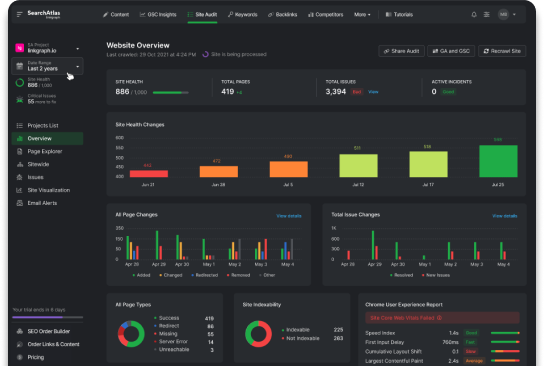
Embarking on the quest to discover leading platforms for visual analytics necessitates an appreciation for the intricate balance between user experience and comprehensive functionality. SearchAtlas by LinkGraph has emerged as a Sophisticated Beacon in this realm, with its seamless user interface and robust analytics, providing a compelling narrative to large datasets without sacrificing depth or detail.
SearchAtlas by LinkGraph distinguishes itself with a robust suite of tools tailored for agility in data presentation and analysis. It allows users to explore big data through interactive, visually engaging charts and infographics, thereby catalyzing the shift from mere data collection to strategic, data-driven decision making within organizations.
A Comparison of Features Across Popular Tools
When scrutinizing the features of prominent data visualization tools, SearchAtlas by LinkGraph rises prominently for its adeptness at conveying complex information. Its expansive capabilities enable users to not only generate but also personalize a multitude of visualization types, including but not limited to dynamic heat maps and intricate line charts, which are necessary for comprehending market trends and customer behavior.
A key differentiator setting SearchAtlas apart is its integration with Advanced SEO Tools, streamlining the process of data interpretation to enhance digital marketing strategies. Unlike basic graphing solutions, SearchAtlas offers more than visualization; it imbues users with the power to maximize the impact of their SEO efforts through data-driven insights, making it an invaluable asset for business analysts and digital marketers alike.
Identifying the Best Tool for Your Analytic Needs
When it comes to identifying the best data visualization tool for your business or project, the decision hinges on a clear understanding of your analytic needs and objectives: what stories do you need your data to tell, and what visuals will best convey those narratives? SearchAtlas by LinkGraph stands out for its tailored approach, designed to meet the varied demands of today’s data-driven environment.
| Feature | Impact | Application |
|---|---|---|
| User Interface | Enhanced Usability | Quick adaptation for various user skill levels |
| SEO Integration | Targeted Analytics | Refined digital marketing and strategy development |
| Big Data Management | Scalable Insights | Accommodates expansive datasets with ease |
Moreover, successful application of such tools necessitates a platform that not only presents data in a comprehensible manner but also provides interpretative mechanisms to extract deeper meaning from the visuals. SearchAtlas excels in this regard, offering stakeholders a nuanced, granular view that extends beyond surface-level patterns to unearth underlying strategic significance.
Understanding Pricing Models for Each Tool
Discerning the intricacies of pricing models associated with data visualization tools is crucial for businesses planning their investment in analytics. These models often vary widely, ranging from subscription-based frameworks to one-time licensing fees:
- Subscription-based models typically entail a periodic fee, offering continual updates and customer support.
- Licensing fees, on the other hand, may involve a larger initial outlay, granting perpetual access to the tool with varying degrees of post-purchase support and updates.
Executives and analysts must weigh these financial considerations against their expected return on investment, acknowledging that while some tools may come with a higher price tag, they may also offer superior depth of analysis and functionality. An informed decision rests on the capacity of the tool to deliver relevant insights that drive strategic business actions and growth.
Why Tableau Is a Leader in Data Visualization

In an era where data is pivotal to strategic decision-making, Tableau has carved out its position as a leading light in the realm of data visualization.
With a suite of intuitive features, it offers professionals dynamic capabilities to transform complex data sets into interactive, insightful visual narratives.
It stands as an exemplar in enabling varied industries to curate real-world success stories, evidencing the power of data-driven outcomes.
Geared toward the needs of professional analysts, Tableau’s advanced functionalities unlock profound depths of analysis, ushering in a new standard of business intelligence excellency.
Key Features That Set Tableau Apart
In the competitive sphere of data visualization, Tableau distinguishes itself through a potent combination of user-friendly drag and drop functionality and real-time data analysis capabilities. This prestigious platform has become a cornerstone for professionals who prize interactivity and accessibility in their analytical tools.
Success in analytics also hinges on collaboration, and Tableau excels with features that facilitate seamless sharing and editing among team members, fostering an environment of collective insight generation. It’s this embodiment of collaborative spirit and advanced features that sets Tableau apart in a market eager for innovation and connectivity.
Real-World Success Stories Using Tableau
Organizations across the globe have harnessed the capabilities of Tableau to derive meaningful narratives from their data, translating analytics into tangible business value. One example includes the Seattle Children’s Hospital, which used Tableau’s data visualization tools to streamline patient data analysis, leading to a significant reduction in hospital-acquired infection rates and improved patient outcomes.
Another compelling case is Verizon, which implemented Tableau’s dynamic dashboards to gain deeper insights into customer behavior and network performance. This adoption empowered data analysts to optimize network operations and enhance customer service, driving Verizon’s strategic initiatives with informed, data-backed decisions.
Advanced Functionalities for Pro Analysts
Professional analysts yearn for tools that extend beyond rudimentary visuals, demanding advanced functionalities that untangle the complexities of extensive data networks. Tableau responds to this professional need with intricate calculation capabilities, blending powerful analytics with interactive dashboard features for granular data dissection.
In a sphere where rapid synthesis of vast information streams dictates successful outcomes, Tableau equips seasoned analysts with real-time collaboration tools, ensuring that critical data points are interpreted with precision and acted upon swiftly by decision-makers.
Power BI: Microsoft’s Answer to Data Insights

Amidst the rapidly evolving landscape of business analytics, Microsoft’s Power BI emerges as a formidable solution for discerning professionals seeking to harness their data’s full potential.
Offering an intuitive and integrated experience, this platform not only bolsters decision-making processes but also fosters a deep connection between data and strategy.
As organizations pivot towards a more data-centric approach, Power BI serves as a linchpin, effortlessly syncing with existing data systems, adapting to the diverse analytic needs of various industries, and providing a treasure trove of educational resources.
These facets collectively fortify Power BI’s position as an essential tool for impactful analytics.
Integrating Power BI With Your Existing Data Systems
Microsoft’s Power BI stands out as a seamless integration tool for existing data systems, offering a unified business intelligence platform that harmonizes with various databases and software. By ensuring compatibility with a broad range of data sources, from MySQL to the Microsoft universe itself, Power BI simplifies the data consolidation process, allowing organizations to capitalize on their accumulated knowledge without the hassle of navigating disparate data environments.
With Power BI’s Robust Connectivity Options, professionals can maintain continuity in their data analytics workflow, enabling an uninterrupted transmission of data into the Power BI ecosystem. This compatibility facilitates a dynamic analysis framework, where the richness of existing data sets is instantly accessible, empowering users to derive swift, comprehensive insights and confidently drive strategic business decisions.
Tailoring Power BI for Various Industry Needs
Microsoft’s Power BI excels in its capacity to adapt to the specific demands of various industries, rendering it an essential instrument for companies ranging from healthcare to retail. It facilitates the creation of Customized Dashboards and Reports that resonate deeply with sector-specific requirements, enabling professionals to pinpoint trends and anomalies peculiar to their domain.
Each industry bears its own set of KPIs and data interpretation necessities, and Power BI addresses this diversity through extensive customization options. Users can manipulate the platform to reflect the vernacular and metrics of their respective fields, which ensures a greater alignment between the data visualized and the operational goals pursued.
- Optimized dashboards to track critical healthcare patient outcomes
- Customized retail sales reports highlighting seasonal trends
- Financial service modules designed for real-time market analysis
- Supply chain management visuals implying throughput efficiencies
Learning Resources to Get the Most Out of Power BI
For professionals eager to extract the maximum benefit from Power BI, Microsoft provides a rich repository of learning resources designed to Enhance User Proficiency. These informative assets range from beginner guides to advanced tutorials, catering to the continuous learning curve of users with various expertise levels.
- Introductory webinars for users new to the data analytics landscape
- Comprehensive documentation and best practices for intermediate users
- Advanced courses focusing on complex data modeling and analysis for seasoned analysts
Exploring these educational materials facilitates mastery over Power BI’s expansive features, allowing users to unravel intricate data stories with increasing efficiency. Organizations stand to reap significant benefits as their employees become adept at deploying Power BI’s tools to illuminate insights that drive decisive action.
The Suite Life: Google Data Studio for Analytics

In the realm of digital analytics and data storytelling, Google Data Studio emerges as a prominent contender, bridging the gap between data and actionable insight.
Its intrinsic ability to synchronize with an array of Google tools, including Google Analytics, infuses data reports with a layer of cohesion and accuracy that is paramount for comprehensive analysis.
With a suite of features focused on facilitating collaboration, it empowers teams to share and iterate on data findings in real-time.
Furthermore, Google Data Studio caters to the individualistic needs of businesses by allowing for the customization of dashboards and reports with remarkable simplicity, enhancing the decision-making process with visually appealing, easy-to-understand data narratives.
Syncing With Google Analytics and Other Google Tools
Google Data Studio stands as a beacon for its synchronization capabilities, effortlessly integrating with Google Analytics and a suite of other Google services. This congruent intertwining ensures a seamless flow of data, enhancing the reliability and coherence of insights gleaned from a user’s suite of analytics tools.
By leveraging the harmonious link with Google’s ecosystem, Google Data Studio enables users to create a centralized hub for their data analysis needs. The platform’s adeptness at aggregating data from numerous sources translates into a streamlined and enriched analytical experience that enhances strategic decision-making.
Sharing and Collaboration Features in Google Data Studio
Google Data Studio stands as a potent solution for team-based data analytics, its sharing and collaboration features designed to facilitate effortless information exchange. By enabling multiple users to interact with reports and dashboards simultaneously, the platform fosters a dynamic analytical environment where insights and visualizations become a collective effort, enhancing the overall quality and speed of data-driven decisions.
The platform’s real-time editing capabilities ensure that every team member can contribute their expertise instantaneously, refining and evolving data narratives as new information surfaces. This aspect of Google Data Studio transcends geographical barriers, uniting remote teams within a cohesive analytical workspace to dissect and harness data for informed strategic planning.
Customizing Dashboards and Reports With Ease
Google Data Studio excels as a potent ally for Visual Storytelling, particularly for its intuitive dashboard and report customization. The drag-and-drop interface simplifies the creation and modification of visual elements, enabling any user to create highly personalized and visually compelling data narratives with minimal effort.
The ease with which one can tailor the aesthetics and functional components of a dashboard or report in Google Data Studio is a hallmark of its design philosophy. Customization options range from basic color and layout choices to more complex data-specific controls, ensuring that each visualization aligns perfectly with the intended message and audience:
- Color schemes and fonts tailored to complement brand identity
- Custom filters and date ranges to make reports more relevant
- Control over data sources for on-point, accurate visualizations
Making Sense of Data With Sisense

Navigating the intricate world of data visualization requires precise tools, and Sisense emerges as a pivotal companion for professionals in pursuit of transformative analytics.
With its intuitive drag-and-drop functionality, Sisense invites users to discover swift insights while its artificial intelligence capabilities advance the horizon into predictive analytics.
Catering to diverse data teams, Sisense seamlessly operates across cloud-based and on-premises infrastructures, offering a versatile solution to the complex requirements of contemporary data analysis.
Organizations seeking a single pane of glass for comprehensive data storytelling are increasingly turning to Sisense for streamlined analytics that align with strategic business objectives.
Drag-and-Drop Functionality for Quick Insights
Sisense distinguishes itself in the data visualization space with its streamlined drag-and-drop functionality, designed to expedite the journey from data to insight. This user-friendly feature enables analysts and business users alike to quickly assemble complex data sets into coherent and interactive visualizations.
The platform’s intuitive interface allows for rapid construction and manipulation of charts and graphs, saving precious time in the analytical process and enhancing productivity across data teams:
- Seamlessly create reports with a simple drag-and-drop gesture.
- Adjust visual components on the fly to uncover hidden insights.
- Collaborate with team members in a dynamic and responsive analytical environment.
Harnessing AI for Predictive Analytics With Sisense
Sisense sets the bar notably high with its utilization of artificial intelligence for predictive analytics, providing an advanced lens through which businesses can anticipate market changes and customer needs. The power of AI within Sisense proffers not just an analytical tool, but a foresight engine that transforms historical data patterns into predictive insights, thus enabling proactive decision-making.
By embedding machine learning algorithms, Sisense empowers users to automate complex analytical tasks, effectively turning vast data swaths into predictors of future trends. This capability positions organizations to not only react to current data but also to strategize with confidence about the implications of that data for future business outcomes.
Sisense for Cloud Data Teams and on-Premises Solutions
Sisense offers a dual advantage with both cloud-based and on-premises deployment options, catering to the diverse infrastructure needs of modern data teams. Its scalable architecture ensures that whether data is stored in the cloud for global accessibility or on local servers for enhanced security, Sisense integrates smoothly, maintaining consistent analytical performance.
Organizations that operate in stringent regulatory environments or have specific data sovereignty requirements find Sisense’s on-premises solution particularly valuable. Meanwhile, teams that prioritize flexibility and remote collaborations are inclined to leverage Sisense on the cloud, which affords them the agility needed to innovate and respond to market dynamics efficiently.
QlikView and Qlik Sense: Data-Driven Decisions

In today’s data-centric business environment, QlikView and Qlik Sense stand at the forefront, offering innovative platforms for data-driven decisions that resonate with modern analytical needs.
These solutions by Qlik harness powerful, user-centric technologies that cater to the proliferating demands for immediacy and depth in business intelligence.
As the marketplace becomes increasingly competitive, grasping the subtleties of the Qlik Associative Model, leveraging Qlik’s self-service BI approach, and understanding the distinct features of QlikView compared to Qlik Sense, are essential steps for organizations aiming to reach the zenith of data fluency and make strategic decisions with greater autonomy and precision.
Understanding the Qlik Associative Model
The Qlik Associative Model is the cornerstone of QlikView and Qlik Sense, setting these tools apart with their dynamic data discovery capabilities. This unique model allows users to uncover hidden trends and patterns across vast and varied datasets by intuitively linking related data points, irrespective of their placement in the initial data structure.
Embracing the Qlik Associative Model enables analysts to conduct searches and analyses in several directions, diverging from the linear exploration that constrains traditional query-based BI tools. Consequently, this model fosters a deeper and broader understanding of the data at hand, promoting comprehensive, informed decision-making throughout the organization.
Qlik’s Self-Service Business Intelligence Approach
In the domain of business intelligence, Qlik’s self-service approach empowers users with autonomy and flexibility. It allows individuals across an organization to create personalized reports and dynamic dashboards, fostering a culture of data democratization.
This hands-on model encourages a proactive stance among non-technical users, effectively decentralizing data analytics and instilling a sense of ownership over the insights generated. This framework ensures that decision-making is informed by a wide array of perspectives, fueling a more comprehensive understanding across departments.
| Feature | Description | Benefit |
|---|---|---|
| Self-Service Capabilities | Intuitive tools for creating analytics content | Empowers users, drives engagement and insight discovery |
| Decentralized Analytics | Data exploration accessible to all organizational levels | Encourages diverse input, enhances decision-making |
| Data Democratization | Broad access to analytics and data resources | Breaks down silos, fosters a data-driven culture |
Comparing QlikView and Qlik Sense Features
As proponents of intuitive and dynamic data visualization, QlikView and Qlik Sense each bring Unique Strengths to the table. QlikView excels with guided analytics, where structured, interactive applications guide users through data exploration: an approach favoring managed, consistent data interaction models. Conversely, Qlik Sense champions self-service visualization, granting users the freedom to create ad hoc analyses and interactive dashboards tailored to their specific inquiries.
| Tool | Analytics Type | User Flexibility | Data Interactivity |
|---|---|---|---|
| QlikView | Guided Analytics | Structured | Managed |
| Qlik Sense | Self-Service Visualization | Adaptive | Dynamic |
The dichotomy between QlikView’s robust data management and sophisticated report generation contrasts with Qlik Sense’s responsive design capabilities and collaborative environment, tailored for group analysis. Understanding the differences in these features empowers businesses to deploy the platform that best aligns with their workflow ethos, ensuring optimal user engagement and data discovery outcomes.
Open-Source Excellence With D3.js

In an era where data not only informs but also drives decision-making, the choice of visualization tool can be critical.
D3.js, an open-source JavaScript library, stands out when bespoke, interactive visualizations are paramount, enabling developers and data scientists to craft comprehensive visual narratives directly in the web browser.
Renowned for its flexibility and its capacity for fine-grained control over the final presentation, D3.js equips organizations and individuals with the ability to create dynamic, browser-based data representations.
As we embark on unpacking the scenarios where D3.js is most effectively employed, the wealth of community knowledge, and the fundamental techniques for assembling interactive visuals, it becomes clear that D3.js is an essential asset in the data visualization toolkit for those seeking precision and customization in their analytical endeavors.
When to Choose D3.js for Your Data Visualization
Opting for D3.js as a data visualization framework is particularly shrewd when customization and control are paramount to a project’s requirements. This JavaScript library affords developers extensive authority over the final visualization, making it possible to construct intricate and unique data-driven documents that fully align with specific brand or research objectives.
D3.js emerges as the tool of choice when interactive, web-based visualizations are essential to an analytics strategy. Organizations that prioritize engaging their audience through sophisticated, browser-accessible charts and graphs will find D3.js’s capabilities incomparable for creating visual stories that are as informative as they are compelling.
Community and Resources for Learning D3.js
The D3.js framework benefits immensely from a zealous community where both neophytes and seasoned developers engage in a collaborative exchange of knowledge. This opens a portal to extensive resources like tutorials, forums, and extensive documentation, facilitating the learning curve for individuals eager to explore the depths of D3.js functionalities.
Reputable online platforms and higher education courses frequently incorporate D3.js into their curricula, offering structured learning paths for those keen on mastering this visualization library. Enthusiasts and professionals alike can leverage these educational sources to augment their competencies, ensuring they remain at the forefront of data visualization innovation.
The Fundamentals of Crafting Interactive Data Visualizations With D3.js
D3.js stands as a pivotal framework for professionals seeking to design data visualizations that are not only detailed but are also fully interactive. This JavaScript library empowers users to bind arbitrary data to the Document Object Model (DOM), and apply data-driven transformations to the document.
| Data Binding | Visualization Feature | Interaction Type |
|---|---|---|
| DOM Synchronization | Dynamic Content Generation | Real-time Data Updates |
| Custom Behaviors | Advanced Animation Effects | User-triggered Events |
| Scalability | Vector Graphics Rendering | Responsive Design |
For users to unlock the full potential of D3.js, mastery over SVG and CSS is imperative, as these technologies facilitate the crafting of graphical elements and the styling of visuals. By harnessing the flexibility of D3.js, professionals create visual experiences that adapt to interactivity and offer viewers a richer, more immersive engagement with data.
The Flexibility of Custom Visualizations With R

In the quest for compelling data storytelling, the tool chosen for visualization can profoundly influence the communicative strength of the analysis presented.
R, a statistical programming language esteemed for its versatility, comes equipped with the Ggplot2 package, elevating the art of crafting custom, detailed charts.
Analysts who embrace R’s capabilities find it indispensable for enriching the narrative power of their data science projects.
By leveraging R, especially for its advanced statistical visualizations, one can uncover data dimensions and subtleties often concealed within raw numbers, converting statistical outcomes into influential visual arguments.
Advantages of R’s Ggplot2 for Custom Charts
The Ggplot2 package in R stands as a testament to customization, enabling data analysts to construct bespoke charts that cater to the nuanced requirements of their respective studies. It operates upon a grammar of graphics, a coherent system for describing and building visualizations, allowing for meticulous control over the aesthetic and structural elements of a chart.
Through the use of Ggplot2, R transcends the conventional bounds of generic charts, offering a platform wherein each component of a graph can be fine-tuned. This level of precision in custom chart creation ensures that every subtlety within the data is effectively communicated, making the visualization a powerful companion to data-driven narratives.
Incorporating R in Data Science Projects
Incorporating R into data science projects allows for a level of statistical analysis and graphic representation that drives meaningful conclusions. The language’s capacity to handle and meticulously analyze complex datasets is indispensable, particularly in scenarios where data informs high-stakes decisions.
The inclusion of R fosters a sophisticated approach to data exploration, enabling scientists and analysts to apply advanced statistical methods and generate bespoke visualizations. This utilization of R translates intricate data into accessible, visually compelling narratives that resonate with both technical and lay audiences:
- Application of R’s sophisticated statistical packages for in-depth data study
- Generation of customized graphs that reveal nuanced data insights
- Creation of reproducible research with R scripts, fostering transparency and collaboration
Emphasizing R in data projects enhances the predictive modeling capabilities of an organization. By leveraging R’s extensive suite of libraries and functions, data professionals can predict trends and patterns with a granularity that informs strategic decision-making across business functions.
Leveraging R for Advanced Statistical Visualizations
Advanced statistical visualizations become vastly impactful when leveraging the analytical power of R. The language, through its comprehensive suite of packages, allows for nuanced explorations and visualizations that reveal patterns, correlations, and regressions with rigorous detail.
Specialists recognize the potential of R to communicate complex statistical concepts through visualization, ensuring that the insights delivered are not only accurate but also intelligible to a diverse audience. Incorporating R’s advanced graphical capabilities becomes especially crucial in sectors where the subtlety of data analysis must be matched with the precision of its visual presentation:
- Executing multivariate analyses depicted through clear, multifaceted visualizations.
- Rendering high-dimensional data structures into comprehensible 2D representations.
- Illustrating predictive model efficacy with visual aids that elucidate statistical soundness.
The significance of advanced statistical visualizations facilitated by R’s capabilities empowers organizations to transition from data-saturated spreadsheets to strategic visual depictions that bolster analytical narratives and foster informed decision-making.
As the digital realm burgeons with information, the need for visually striking and shareable data representations becomes paramount for engaging audiences.
Infogram steps into the spotlight as a versatile tool designed for crafting vibrant infographics that captivate viewers.
Its user-friendly interface simplifies the creation of professional-quality visuals, while an extensive range of icons and designs sparks creative storytelling.
The simplicity with which users can disseminate and integrate their visualizations across various platforms amplifies the reach of data narratives, making Infogram a critical asset for professionals seeking to merge aesthetic appeal with analytical clarity.
Drag-and-Drop Your Way to Engaging Infographics
Infogram revolutionizes the creation of infographics with its intuitive drag-and-drop interface, empowering professionals from various fields to produce visually appealing and informative graphics with relative ease. The platform’s streamlined process eliminates the steep learning curve often associated with advanced design software, enabling users to focus on the communication of their data rather than grappling with complex editing tools.
- Select pre-designed templates or create custom layouts with simple dragging motions.
- Populate your infographics with relevant data points using easy-to-navigate menus.
- Enhance storytelling by incorporating vibrant charts and graphical elements with a click.
The sophistication embedded into Infogram’s user experience ensures that even those with limited design background can craft compelling narratives that resonate with their audience. By transforming data visualization into a straightforward and accessible endeavor, Infogram facilitates the creation of powerful data stories that can elevate presentations, reports, and digital content.
Infogram’s Vast Library of Icons and Designs
Infogram stands as a treasure trove for visual communicators, hosting a vast library of icons and designs. This reservoir of graphical elements is a boon for creating infographics that are not only visually stunning but also resonate with the message they aim to convey.
Design novices and veterans alike relish the diversity and quality of Infogram’s resources, which streamline the process of transforming complex data into captivating and shareable visual stories. Embracing Infogram’s rich selection empowers creators to articulate their narratives with a visual flair that engages and informs audiences.
Sharing and Embedding Options for Wide Outreach
Infogram not only facilitates the creation of visually engaging infographics but also ensures that these creations can easily travel across digital landscapes. The platform incorporates powerful sharing and embedding features, allowing users to seamlessly integrate their visuals into websites, blogs, and social media platforms, thereby maximizing the reach of their data-driven stories.
The ease of dissemination that Infogram provides supports the proliferation of information, transforming complex datasets into accessible and widely shared visuals. Professionals leverage this capability to connect with larger audiences, fostering greater impact as they translate data insights into universally understandable and attractive formats.
The Power of Python in Data Visualization

In the intricate realm of data visualization, Python has emerged as a transformative force, providing a versatile foundation for crafting detailed, interactive visual narratives.
With its various libraries tailored to different visualization needs, Python equips analysts and data scientists with tools to express their data’s stories compellingly and coherently.
As organizations pivot towards Python to redefine their analytics landscape, it becomes increasingly important to explore how it integrates with myriad other technologies to yield a truly comprehensive suite of insights.
This progression places Python at the vanguard, not only as a stand-alone analytical powerhouse but also as a synergistic ally in the greater constellation of data visualization resources.
Python Libraries for Diverse Visualization Types
Python emerges as a formidable player in the data visualization field, thanks to its extensive assortment of libraries designed to tackle a broad spectrum of visualization challenges. Each library serves a specific purpose, from rendering statistical graphics to producing complex interactive plots, fortifying Python’s position as a vital resource for insightful data storytelling.
Among these libraries, Matplotlib and Seaborn shape the foundational layer for static visualizations, while Bokeh and Plotly extend the capabilities into the realm of interactive graphs and dashboards. These Python libraries enable users to interpret and present data through a variety of lens, catering to the nuanced demands of diverse analytical audiences:
| Library | Type of Visualization | Use Case |
|---|---|---|
| Matplotlib | Static 2D Graphics | Classic scientific visualizations like histograms and scatter plots |
| Seaborn | Statistical Data Visualization | Enhanced interface for complex multivariate analysis |
| Bokeh | Interactive Web Plots | Leveraging browser capabilities for real-time, dynamic data presentations |
| Plotly | Interactive & 3D Graphics | Creating high-quality, publication-ready, interactive graphs |
These libraries are cornerstones of Python’s visualization prowess, providing the scalability and flexibility required to convert raw data into compelling visual communication. Analysts and data scientists deploy these tools to achieve clarity and impact in data interpretation, contributing to the strategic advantage and analytical depth of their findings.
Case Studies: How Python Is Revolutionizing Analytics
The power of Python for data visualization is vividly illustrated in the success stories of contemporary analytics. Organizations are leveraging Python’s versatile libraries to uncover trends that were once buried in complex data sets, paving the way for innovations that resonate across industries.
- Financial analysts are using Python’s data visualization capabilities to forecast economic shifts with enhanced accuracy, leading to more informed investment decisions.
- Healthcare data scientists apply Python’s robust plotting libraries to map patient data, revealing patterns that drive improvements in medical treatments and personalized care.
In the education sector, institutions are harnessing Python to transform student performance data into actionable strategies for learning enhancement. The agility of Python’s visualization tools allows for the agile adaptation of teaching methodologies in line with emerging educational trends and outcomes.
Blending Python With Other Tools for Comprehensive Insights
Python’s data visualization capabilities reach new heights when combined with other analytical tools. Integrating Python with platforms like Microsoft Power BI or Google Data Studio can significantly enhance the depth and scope of insights. These hybrid solutions enable organizations to leverage Python’s advanced analytical functions with the other platforms’ intuitive interfaces and reporting features.
For instance, Python’s analytical muscle can be utilized for initial data processing, while visualization tools like Tableau serve to render the results into striking, interactive dashboards. This symbiosis between Python and dedicated visualization platforms allows for a more finely tuned presentation of insights:
| Data Processing Tool | Visualization Platform | Combined Advantage |
|---|---|---|
| Python Libraries | Microsoft Power BI | Advanced analytics with business intelligence reporting |
| Python Scripts | Google Data Studio | Fluid data manipulation with user-friendly dashboard creation |
| Python Models | Tableau | Complex statistical processing with dynamic visualization |
Connected systems that blend Python’s prowess with specialized visualization environments broaden the horizon for business intelligence. They furnish analysts with the means to not only unlock but also to showcase intricate patterns and predictions that can drive strategic business decisions.
Conclusion
Data visualization tools stand as essential instruments in the translation of raw data into actionable insights, shaping the decision-making landscape across industries.
SearchAtlas, with its user-friendly interface and SEO integration, is exemplary for those seeking to align their data analytics with digital marketing strategies.
Tableau sets a high bar with interactive, collaborative features that have been pivotal for organizations like Seattle Children’s Hospital and Verizon to realize data-driven success stories.
Microsoft’s Power BI offers seamless integration with existing data systems and industry-tailored customization, making it invaluable for varying analytical demands.
Google Data Studio’s strong suit lies in its compatibility with Google’s suite and its collaborative, customizable reporting tools.
Sisense brings AI-driven predictive analytics into the fold, while QlikView and Qlik Sense offer distinct approaches to guided analytics and self-service visualization, rooted in the powerful Qlik Associative Model.
The open-source library D3.js is the go-to for developers seeking bespoke, interactively rich visualizations.
For those in the statistical realm, R and its Ggplot2 package provide unparalleled customization depth for data representation.
Infogram, catering to a more design-centric user base, simplifies infographic creation, making data both beautiful and shareable with a vast library of designs.
Lastly, Python emerges as a multifaceted powerhouse, especially when leveraged with other analytics tools, to present clear, impactful visual narratives.
In conclusion, the diverse range of data visualization tools available today offers a multitude of pathways to illuminate complex data and foster insightful, data-driven action.
Each tool, with its unique strengths and features, ensures that businesses can find the right fit to communicate their data effectively, enhance predictive capabilities, and ultimately drive growth.