


- Home

- Blog
- Advanced SEO
- Google Analytics: Free Reporting Tools for Data Analysis
Google Analytics: Free Reporting Tools for Data Analysis
Top Free Google Analytics Reporting Tools for Data Insights In the bustling ecosystem of digital marketing, the ability to distill actionable insights from a sea of data […]
Top Free Google Analytics Reporting Tools for Data Insights
In the bustling ecosystem of digital marketing, the ability to distill actionable insights from a sea of data stands as the cornerstone of strategy.
The emergence of free Google Analytics reporting tools has transformed the landscape, enabling businesses to navigate through their marketing data with precision and ease.
From tailoring dashboards to tapping into advanced analytics platforms, these tools equip marketers with the prowess to monitor website traffic, understand user behavior, and optimize conversion rates.
In this article, discover the leading reporting tools that promise to elevate your data analysis and enhance your decision-making capabilities.
Keep reading to unravel the potential of each platform and harness the power of data-driven marketing.
Key Takeaways
- Google Data Studio Enables Detailed Data Reporting Through User-Friendly Interfaces and Customizable Visualizations
- Dashboards in Analytic Tools Provide Real-Time Insights and Foster Collaborative Data Analysis Within Teams
- Alternative Platforms Like Cyfe and Matomo Offer Diverse Analytics Capabilities Respecting User Data Privacy
- Utilizing Tools Like Table Booster for Segmentation Enhances the Precision and Clarity of Google Analytics Reports
- Professional Customization of Analytics Dashboards Enhances Marketing Strategies and User Experience, Leading to Better ROI
Unveiling the Power of Google Data Studio

In the bustling sphere of digital marketing, an acute comprehension of data is indispensable.
Business entities and marketing agencies incessantly seek robust tools to transform overwhelming amounts of data into coherent, actionable insights.
Google Data Studio emerges as a beacon for such endeavors, offering a seamless transition from raw data to meticulous reports.
Emphasis on user-friendly interfaces and customization propels Data Studio into the spotlight as an invaluable resource for those keen on augmenting their marketing intelligence.
This section delves into a practical, step-by-step guide for integrating Data Studio with a business’s analytics measures, as well as proffering tips to expertly craft visual representations that encompass the multifaceted narrative of one’s marketing data.
Step-by-Step Guide to Integrating Data Studio With Analytics
Integrating Google Data Studio with an analytics platform equips businesses with the capability to craft tailored reports that enhance decision-making processes. The key lies in linking data sources such as Google Analytics 4 (GA4), Looker Studio, or other marketing platforms to the Data Studio environment.
The procedure begins with the selection of a data connector within Data Studio’s gallery, followed by authorization to access the pertinent Google Analytics account:
- Navigate to Data Studio and start with a fresh report template or a pre-designed one from the gallery.
- Select the “Add data” option to reveal a wide array of connectors categorized under Google Connectors and Partner Connectors.
- Choose the desired Google Analytics connector to sync data seamlessly from the associated Google Analytics account.
Once the correct source is established, users can proceed to arrange data into customizable visualizations, thereby crafting a dashboard that resonates with a client’s unique reporting requirements. This step amplifies marketing insights, propelling data narrative into a strategic asset for client reports and campaign evaluations.
Tips for Visualizing Analytics Data With Data Studio Reports
Mastering the art of visualization in Google Data Studio hinges upon the selective use of charts and graphs to convey the essence of complex data: A feat that transforms numbers into narratives. By tailoring visual elements such as color schemes, font choices, and graph types to align with a client’s brand or campaign theme, the data not only informs but also engages.
- Employ bar or line charts to depict trends over time, spotlighting the growth metrics that matter most to the client.
- Utilize pie charts or donut charts for a clear depiction of market share or session distributions across different channels.
- Incorporate geographic maps when representing data with a locational element, like website traffic from various regions.
- Customize dashboards with scorecards to capture snapshots of critical metrics such as bounce rate or conversion rate at a glance.
Equally important is the strategic placement of filters and date range controls within the reports, empowering clients to interact with the dashboard: They can dissect data on-the-fly, peering into different segments, campaigns, or time periods. As each visualization adapts, it provides immediate context, allowing users to discern trends and anomalies with precision.
Discover What Google Analytics Dashboards Offer

As the digital landscape continues to expand, the efficacy of decision-making in marketing campaigns hinges on the clarity and depth of analytical insights.
Google Analytics dashboards, a cornerstone in deciphering online performance, stand at the forefront of this revelation.
Customizing your dashboard becomes a critical step in highlighting the metrics that matter, while sharing and collaboration features ensure that team members are aligned and interactive with the data story being told.
This convergence of customization and collaboration within Google Analytics dashboards holds the key to not only tracking vital metrics efficiently but also fostering a data-driven culture within organizations.
Customizing Your Dashboard for Key Metrics Tracking
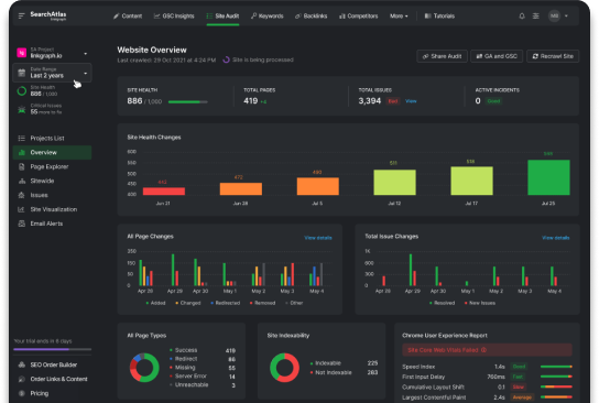
In the realm of digital analytics, the customization of dashboards stands as a critical exercise, enabling users to pierce through the veil of data clutter to expose the most relevant metrics. LinkGraph‘s extensive experience with Google Analytics dashboards underscores the pivotal role they play in optimizing campaigns, enriching user experience, and driving conversions with targeted data visualization.
Through vigilant customization, agencies and businesses hold the capacity to distill ample streams of visitor interactions into digestible snapshots of user behavior, campaign performance, and site health. The integration of Google Analytics dashboards within marketing strategies wielding LinkGraph’s SEO prowess ensures a guided and empirical approach to refining marketing efforts.
Sharing and Collaborating on Analytics Dashboards
Google Analytics Dashboards are not merely a solitary point of analysis; they are designed to foster a collaborative environment that empowers multiple stakeholders to engage with data effectively. The sharing functionality ensures that critical insights are disseminated in real-time, facilitating a unified approach to interpreting visitor behavior and campaign metrics.
Utilizing these dashboards for collaborative purposes allows teams to operate with synergy, as each member can contribute to the dashboard configuration and bring their unique perspectives to the interpretation of the data. This collective analysis can lead to more comprehensive strategies and refined marketing campaigns, bolstered by shared understanding and refined by collective expertise.
Explore the Efficiency of Cyfe for Insights Gathering

In an era where data reigns supreme, the quest for comprehensive, yet accessible analytics tools leads to the exploration of platforms like Cyfe, which stands out for its versatility in dashboard creation and monitoring real-time data.
As businesses endeavor to stay attuned to their online presence, Cyfe offers a multi-faceted approach to consolidate key Google Analytics metrics onto a singular pane of glass.
This dynamic platform not only enables the creation of customizable dashboards tailored to diverse monitoring needs but also facilitates the extraction of real-time insights, effectively bridging the gap between data collection and strategic implementation.
Creating a Multi-Purpose Dashboard With Cyfe
With the introduction of Cyfe, businesses harness the capacity to erect a commanding, multi-purpose dashboard, centralizing disparate data feeds into a single, interactive display. This confluence of data streams drives analytical prowess, ensuring decision-makers are equipped with a comprehensive, real-time analytics tableau for decisive action.
Cyfe’s adaptable dashboard design caters to individual business requirements, underpinning a bespoke analytical experience. Professionals can tailor visualizations to align with specific objectives, enabling a consolidated view across various marketing campaigns and audience behaviors, whilst ensuring seamless report generation and data-driven storytelling.
How to Pull Real-Time Google Analytics Data With Cyfe
Pulling real-time data from Google Analytics into Cyfe is a seamless process that brings a new level of immediacy to dashboard analytics. By utilizing Cyfe’s custom widgets, users easily connect their Google Analytics accounts, granting immediate access to a live stream of user interactions and website performance metrics.
This connection not only simplifies the monitoring of current campaigns but also empowers professionals with the capability to respond swiftly to changes in visitor behavior or market trends. The real-time data amalgamation with Cyfe’s dashboards ensures that businesses sustain a proactive stance in their marketing decisions and strategy implementations.
Leveraging Matomo’s Open Source Platform for Reporting

In the realm of web analytics, the need for granular data alongside user privacy has catalyzed a surge in the adoption of alternative platforms like Matomo.
This open-source analytic tool not only aligns with the tightening regulations in data protection but also offers a comprehensive suite of reporting features, setting it apart as a commendable alternative to Google Analytics.
Companies venturing into the capabilities of Matomo find themselves equipped with a robust set of tools for tracking website traffic and user engagement without compromising visitor privacy.
Contemporary professionals navigating through Matomo’s interface appreciate its intuitive design and expansive reporting features, ensuring an in-depth understanding of their site’s performance and audience trends.
This introduction serves to shed light on the process of setting up Matomo as well as exploring the robust reporting features it brings to the table.
Setting Up Matomo as an Alternative to Google Analytics
Expanding the horizons of web analytics, businesses and marketing agencies are turning towards Matomo as a credible alternative to Google Analytics. As an open-source platform, Matomo enables users to maintain complete ownership of the analytics data, delivering the dual benefits of transparency and control, thus ensuring compliance with user data protection guidelines.
Setting up Matomo involves a straightforward installation process where privacy and data accuracy stand front and center. Once integrated with their website, professionals can leverage the rich, real-time insights Matomo provides, meticulously tracking every action visitors take without infringing on personal privacy, a cornerstone of today’s digital environment.
Navigating Through Matomo’s Reporting Features
Navigating through Matomo’s robust reporting features unveils a world of analytics capabilities that rival those of mainstream platforms. Users discover a suite of intuitive reports that cover a range of metrics, from real-time visitor tracking to detailed behavior analysis, all designed to offer comprehensive insights into both website performance and user engagement.
The reports generated by Matomo allow for a profound level of detail, providing users with the ability to segment their data meticulously and visualize their performance across various dimensions. Users benefit from the data richness with features like custom report creation and advanced e-commerce tracking:
- Custom Reports: Tailor your reports with specific metrics that align with your business objectives and KPIs.
- Visitor Behavior: Gain insights into how users interact with your site and which pages capture their attention the longest.
- E-commerce Tracking: Understand your sales funnel with advanced reporting on shopping cart abandonment and purchase patterns.
- Goal Conversion: Monitor the effectiveness of marketing campaigns and track conversion rates to measure success.
Mastering Segmentation in GA Reports With Table Booster

Segmentation stands as a key practice within the realm of analytics, particularly when dealing with Google Analytics reports. It allows for granular analysis, as users can isolate and examine subsets of their data for more precise insight. Table Booster, a dynamic reporting tool, enhances this capability by offering easy-to-deploy segmentation features directly within Google’s analytical interface.
Utilizing Table Booster, professionals gain an edge in data analysis, creating segments that filter out the noise and highlight the information crucial to a company’s strategy. By presenting data through clear segment division, Table Booster delivers a clarity that traditional reports may lack. This is particularly useful for in-depth Backlink Analysis or when assessing the efficacy of a local SEO strategy.
| Segment | Session Count | Conversion Rate | Bounce Rate |
|---|---|---|---|
| New Visitors | 15,000 | 2.5% | 40% |
| Returning Customers | 5,000 | 5.0% | 25% |
| Paid Search Traffic | 8,000 | 4.0% | 35% |
The above table reflects the utility of Table Booster within analytics reporting; it provides a snapshot of differing segments: new visitors, returning customers, and paid search traffic. The data illustrates session count, conversion rate, and bounce rate, offering actionable insights into where optimization efforts should be focused to improve overall website performance and user experience.
LinkGraph recommends leveraging such free tools to augment the native capabilities of Google Analytics. Enhancing data presentation through segmentation not only sharpens the competitive edge of businesses but also streamlines the marketing efforts towards achieving higher ROI. With expert application, Table Booster can transform the vastness of Google Analytics data into a concise narrative, guiding client reports and strategic decision-making.
Frequently Asked Questions
How can Google Data Studio help in analyzing and presenting Google analytics data effectively?
Google Data Studio transforms complex marketing data into customizable, easy-to-understand reports, enabling businesses to glean actionable insights and present findings compellingly. With its capacity to pull data from various sources, including Google Analytics, it allows users to create holistic, visually engaging reports tailor-made for showcasing metrics like pageviews, bounce rate, and campaign performance.
What are the key features and benefits of using Google analytics dashboards for reporting?
Google Analytics dashboards streamline the process of monitoring and analyzing web data by providing customizable modules that display key metrics at a glance, enabling businesses to make informed decisions more efficiently. They offer a centralized location for tracking performance indicators, such as bounce rates and conversion rates, thus empowering companies with real-time insights into their online marketing campaigns and user behavior.
How does Cyfe compare to other reporting tools in terms of efficiency and data insights gathering?
LinkGraph stands out not for its comparison to Cyfe or any other reporting tool but for its integrated services that streamline SEO processes and data insight gathering through Search Atlas. The platform elevates efficiency by providing a comprehensive suite of tools like SEO audits, content strategy development, and white label link building, tailored to enhance the user’s search engine optimization endeavors.
What advantages does Matomo’s open source platform offer for generating comprehensive reports?
Matomo’s open source platform provides users with the advantage of full data ownership and privacy compliance, enabling them to generate detailed reports without the risk of data sharing inherent in some third-party services. Moreover, its customizable dashboard allows for an extensive view of web analytics, granting businesses the flexibility to tailor reports to their specific needs and marketing objectives.
How can table booster enhance segmentation capabilities in Google analytics reports?
Table Booster can enhance segmentation capabilities in Google Analytics reports by empowering users with advanced data visualization tools, allowing for deeper insights and more granular analysis of audience behaviors and patterns. Utilizing Table Booster’s sophisticated functionalities, marketers can effectively dissect marketing data, which leads to more tailored and successful campaign strategies.
How does integrating Google Data Studio with analytics platforms enhance the creation of tailored reports for businesses?
Integrating Google Data Studio with analytics platforms enables businesses to craft customized reports by linking data sources such as Google Analytics 4 and Looker Studio. This process involves selecting a data connector, authorizing access to the relevant Google Analytics account, and arranging data into customizable visualizations. The resulting dashboard caters to unique reporting requirements, amplifying marketing insights for client reports and campaign evaluations.
What strategies can professionals employ to master the art of visualization in Google Data Studio reports?
Professionals can master the art of visualization in Google Data Studio reports by selectively using charts and graphs to convey complex data narratives. Tailoring visual elements, such as color schemes, font choices, and graph types, to align with a client’s brand or campaign theme enhances engagement. Strategies include using bar or line charts for trend analysis, pie charts for market share representation, incorporating geographic maps for locational data, and utilizing scorecards for capturing critical metrics at a glance.
How do Google Analytics dashboards contribute to fostering a data-driven culture within organizations?
Google Analytics dashboards play a crucial role in fostering a data-driven culture within organizations by offering customization and collaboration features. Customizing dashboards highlights key metrics, while sharing and collaboration functionalities ensure team members are aligned and interactive with the data story. This convergence empowers teams to track vital metrics efficiently, fostering collective analysis, and refining marketing campaigns with shared understanding and expertise.
In what ways does Matomo’s open-source platform address user privacy concerns in web analytics?
Matomo’s open-source platform addresses user privacy concerns in web analytics by providing users with complete ownership of analytics data. This approach ensures compliance with data protection guidelines while offering a comprehensive suite of reporting features. Users can set up Matomo through a straightforward installation process, maintaining transparency and control over their analytics data. Matomo’s intuitive design and reporting features contribute to an in-depth understanding of site performance and audience trends without compromising visitor privacy.
How does Table Booster enhance segmentation capabilities in Google Analytics reports, and what benefits does it bring to data analysis?
Table Booster enhances segmentation capabilities in Google Analytics reports by providing easy-to-deploy segmentation features directly within Google’s analytical interface. Professionals can utilize Table Booster to create segments that filter out noise and highlight crucial information for a company’s strategy. This leads to a clear and granular analysis, beneficial for tasks like Backlink Analysis or evaluating the effectiveness of a local SEO strategy. Leveraging Table Booster can transform the vastness of Google Analytics data into a concise narrative, guiding client reports and strategic decision-making.
Conclusion
In the dynamic landscape of digital marketing, the ability to dissect and interpret data is crucial for driving strategic initiatives and optimizing campaigns.
Essential to this process are top free Google Analytics reporting tools that provide deep data insights without added cost.
Google Data Studio stands out for its ability to create custom, user-friendly reports that turn raw data into powerful narratives, essential for making informed marketing decisions.
Concurrently, Google Analytics dashboards offer a collaborative space for customizing and sharing key metrics, enhancing decision-making and fostering a data-centric culture within teams.
Cyfe, with its real-time data capabilities and customizable dashboards, enables businesses to be agile and responsive to market dynamics.
Matomo offers an open-source alternative with comprehensive reporting features, focusing on user privacy while yielding granular site and visitor analytics.
Lastly, tools like Table Booster maximize Google Analytics reports by allowing for detailed segmentation, providing crystal-clear, actionable insights.
Together, these free tools are invaluable resources for businesses looking to harness the full potential of their data, ultimately securing a competitive edge and driving successful outcomes in their digital marketing efforts.