


- Home

-
- Visualize Data: Best Visualization Tools
Visualize Data: Best Visualization Tools
Discover the Best Tools for Visualizing Data In the age of big data, the ability to convert complex information into digestible visual representations is priceless. From business […]
Discover the Best Tools for Visualizing Data
In the age of big data, the ability to convert complex information into digestible visual representations is priceless.
From business analysts to data scientists, professionals across industries rely on state-of-the-art visualization tools to reveal insights that data alone might conceal.
These powerful software options not only enhance understanding but also empower storytelling, turning raw data into compelling narratives for decision-makers.
With the right tool, customization, scalability, and interactivity bring data to life in a way that charts in a simple spreadsheet can never achieve.
Keep reading to discover which visualization tools are leading the way and how they can transform your data analysis into visual masterpieces.
Key Takeaways
- Advanced Data Visualization Tools Are Essential for Various Sectors to Transform Complex Datasets Into Actionable Insights
- Customizable Features and Templates in Visualization Tools Enhance Brand Identity and Audience Engagement
- Real-Time Data Interaction and Collaboration Tools Within Platforms Are Key for Strategic Decision-Making and Team Synergy
- Accessibility Features, Educational Resources, and User-Friendly Designs Are Crucial for Democratizing Data Visualization Tools
- Enterprise-Level Visualization Solutions With Robust Security and Data Processing Capabilities Are Vital for Handling Large-Scale Datasets
Unveil the Power of Visualization With Top Tools

In today’s fast-paced digital environment, the ability to transform raw data into compelling visual narratives is no longer a luxury but a necessity for businesses across various sectors.
As we explore the myriad of data visualization tools available, it’s essential to discern the subtleties of features they offer.
Critical analysis of each tool’s capabilities enlightens users on the alignment with their specific project needs.
An intuitive user interface and a smooth user experience stand paramount in selecting the right tool, as they determine the efficiency with which users can translate data into visuals.
Customization options offer the flexibility to tailor visualizations to one’s brand and message, while integration capabilities ensure seamless workflow within an existing technological ecosystem.
Moreover, ongoing support and an active community are invaluable assets that can empower users to maximize their tool’s potential and keep pace with an ever-evolving field.
As this article continues, individuals and organizations will be equipped with the insight needed to harness the power of top data Visualization Tools for Insightful, data-driven storytelling.
Understanding the Capabilities of Each Tool
Embracing the depth and breadth of data visualization tools is akin to a scientist sifting through a complex data set; it requires keen understanding and meticulous attention to detail. The right tool can provide not just charts and bar graphs, but a sophisticated suite of visual analytics to convey complex information effortlessly.
Determining the perfect tool involves assessing its database compatibility, scalability to handle large data sets, and the variety of visualization options it houses. Such scrutiny ensures that the data’s story is not just told, but captivatingly so:
- Database compatibility checks ensure seamless data integration.
- Scalability considerations promise that as datasets grow, the visualization tool adapts.
- A diversity of visualization options enables the tailoring of data stories to specific audiences.
Comparing User Interface and Experience
In the realm of data visualization, the allure of a user interface (UI) lies in its simplicity and clarity, ensuring that even complex data can be navigated with ease. The experience it provides, formidably affects a user’s ability to engage with the visualization tool, confirming that aesthetics must blend with practical functionality.
More than a visual gateway, the persona of a user interface acts as a silent guide, leading users through data landscapes with intuitive controls and responsive design. As the interface communicates smoothly with its users, it elevates the usability of the tool, marking the difference between a mere instrument and a powerful ally in data storytelling.
- Seamless navigation enhances the engagement with complex data.
- Aesthetic functionality is where design meets utility.
- Intuitive controls and responsive design are the cornerstones of user satisfaction.
Assessing Customization Options
When it comes to data visualization, the ability to customize is a distinguishing factor that sets superior tools apart. Tailoring visual elements to match the branding and messaging of your organization not only strengthens the narrative but also reinforces brand recognition.
Options for customization extend beyond mere color palettes and font choices; they encapsulate the breadth of your storytelling capability, from the layout of the infographic to the interactivity of your chart:
- Brand alignment through visual customization adds a layer of professionalism and consistency.
- Interactive elements engage users, offering them a dynamic experience as they delve into the data.
- The layout adjustment provides a structured path for audiences, guiding their journey through the narrative.
With insightful customization features, these sophisticated tools not only present data but invite audiences into an immersive analytical experience. The power of a well-designed visualization lies in its ability to simplify complex information, creating a bridge between data and the decision-makers.
Integrations With Your Current Stack
Effective data visualization transcends the boundaries of standalone software, demanding synergistic integration with existing business systems. Leaders in Data Visualization Technology recognize this and offer robust solutions that plug into current stacks seamlessly, ensuring continuity and enhancing organizational agility.
Choosing a data visualization tool that melds with your suite of applications not only streamlines processes but also unlocks the potential for advanced analysis. By weaving together disparate systems, businesses unlock a cohesive narrative that informs strategy with clarity and precision.
Support and Community Resources
Robust support and an active community are the cornerstones of any Successful Data Visualization Tool‘s ecosystem. Such resources equip users with the confidence to navigate challenges and leverage the tool’s full capabilities, thus enabling them to craft impactful data stories with agility and assurance.
The presence of a dedicated customer support team provides the backbone for user reliance, ensuring queries and technical hiccups are addressed with expediency. Meanwhile, an engaged community acts as a think tank, fostering innovation and collaborative problem-solving, enhancing the tool’s value beyond its core functionalities.
Streamline Your Data Analysis With Interactive Tools

In the age of big data, where information overload can be a significant hindrance, the right data visualization tools can be a game-changer.
These tools not only simplify complexity but also enhance interpretability and communication within teams and to stakeholders.
Key to maximizing such advantages is an array of features designed for ease of use and collaboration.
Exploring drag-and-drop functionalities, users can swiftly manipulate data sets, crafting interactive visual narratives without the need for extensive coding knowledge.
Real-time data interaction ensures decisions are informed by the latest insights, while collaboration tools augment team synergy on projects.
Illuminating the transformative power of these tools, various case studies highlight how interactive visualization drives success, showcasing the practical application and results of engaging data presentation.
Exploring Drag-and-Drop Features
Unlocking the potential of data often hinges on the simplicity of the tool being used. A primary feature of prowess among top-tier visualization tools is the drag-and-drop functionality, which empowers users to craft compelling data stories with ease, circumventing the need for complex programming skills.
With the implementation of robust drag-and-drop features, data analysts and business professionals can effortlessly customize their visualizations. This functionality promotes an efficient and streamlined process for constructing and rearranging charts, graphs, and other visual aids, enhancing the narrative that the data conveys.
Benefits of Real-Time Data Interaction
Real-time data interaction is the linchpin of efficiency and informed decision-making in today’s dynamic marketplace. It equips teams with the agility to respond to live data, ensuring strategic moves are always grounded in the most current information.
Incorporating real-time data into visualization tools transforms static charts into living documents that evolve with each fresh dataset. This process provides a continuous feedback loop, optimizing operational performance and sharpening competitive edge:
- Agility in decision-making is achieved as users harness live updates.
- Operational performance is honed through a consistent stream of current data.
- Users maintain a sharp competitive edge by leveraging real-time insights.
Collaboration Tools for Team Projects
Effective teamwork forms the bedrock of any successful project, and collaboration tools within Data Visualization Platforms are critical in fostering a harmonious work environment. These features allow multiple users to engage with data simultaneously, offering diverse perspectives that enrich the analysis process.
Facilitated by these shared digital spaces, teams can merge their expertise to refine insights and draw more accurate conclusions. There is an emphasis on synergy, ensuring edits and updates are universally accessible and team members stay aligned with project developments:
| Feature | Benefit | User Role |
|---|---|---|
| Live Editing | Enables collaborative analysis in real-time | Data Analyst |
| Permission Settings | Guards sensitive data, controlling user access | Project Manager |
| Integrated Communication | Streamlines discussion within the platform | Team Member |
| Version History | Tracks changes for accountability and referencing | Quality Assurance |
The strategic application of such collaborative tools within data visualization software harmonizes individual strengths, curating an empowered team unified in its purpose and direction.
Case Studies: Success Stories of Interactive Visualization
Highlighting the efficacy of interactive visualization tools, a renowned marketing agency recently shared their success story, where the implementation of dynamic charts and responsive data dashboards significantly amplified clients’ understanding of complex market trends. This intuitive approach to data allowed for real-time scenario planning and enhanced stakeholder communication, resulting in optimized marketing strategies and improved return on investment.
In another instance, a progressive urban planning firm featured their interactive geographic information system that transformed civic data into engaging, user-friendly visual stories. Stakeholders were not only able to visualize the geographical impact of urban projects but also interactively simulate potential future developments, facilitating more informed decision-making and fostering community involvement in the planning process.
The Rising Stars in Data Visualization Software

Amid the rapidly evolving landscape of data visualization, emergent software solutions are capturing the attention of both data professionals and business analysts alike.
These new entrants are competing on the strength of their innovation, bringing unique features to the forefront that are poised to disrupt the status quo.
With the promise of scalability and the potential to accommodate growing data demands, these tools present an exciting window into the future of data analysis.
This paragraph serves as a portal that ushers in a closer examination of the standout capabilities these revolutionary tools offer, the monumental shifts they could bring to the industry, and their capacity to expand and excel as they become integral to data-driven decision-making.
Highlighting Emerging Tools in the Market
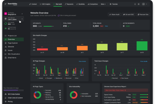
In the digital epoch we find ourselves in, the emergence of innovative data visualization tools heralds a new era of insight and comprehension. A deep dive into the market reveals tools like SearchAtlas by LinkGraph, which is rapidly carving out a niche for itself with advanced features that cater to both burgeoning businesses and seasoned data scientists alike.
SearchAtlas shines by integrating alertness to market shifts and user-centric design, fostering tools geared towards enhancing keyword research and executing data-driven marketing strategies. LinkGraph’s offerings extend into digital PR services, PPC Google Ads, and Amazon PPC ads, providing a holistic approach to online visibility and brand growth:
| Tool Feature | Primary Benefit | User Impact |
|---|---|---|
| SEO Content Assistant | Optimizes content for search engines | Improves online content strategy |
| Free SEO Audit | Identifies areas for SEO improvement | Enhances website performance |
| Link Building Services | Strengthens link profile | Increases domain authority |
The tools emerging in today’s market not only facilitate the visualization of complex data but also contribute significantly to the strategic operations of businesses. Through continuous innovation and a commitment to user needs, SearchAtlas by LinkGraph exemplifies the pinnacle of current data visualization offerings, empowering users with sophisticated analytics and actionable insights.
Unique Features of Newcomer Tools
In the vanguard of data visualization, newcomer tools deliver bespoke features, setting them apart from legacy systems. SearchAtlas by LinkGraph stands firm as a testament to innovation, offering an SEO Content Assistant that revolutionizes content optimization for maximal search engine visibility:
| Feature | Impact | Target User |
|---|---|---|
| SEO Content Assistant | Enhances content for higher SERP rankings | Content Marketers |
| Digital PR Services | Boosts online presence and authority | PR Specialists |
| PPC Google Ads Services | Increases ROI on ad spend | Digital Advertisers |
Newcomer tools not only excel in functionality but also prioritize a seamless user journey, encapsulated by intuitive interfaces and smart content planning tools. Elevating the LinkGraph experience, they provide a free SEO audit, enabling businesses to swiftly pinpoint and rectify website deficiencies for enhanced search engine performance.
Predictions for Industry Disruptors
Industry disruptors in data visualization are poised to redefine the landscape with groundbreaking solutions like SearchAtlas by LinkGraph. These cutting-edge platforms are expected to introduce unprecedented levels of automation, enabling users to achieve high-caliber SEO outcomes with enhanced efficiency and precision.
As the digital marketplace evolves, the tools that offer extensive data analysis, insightful automation, and sophisticated user experiences will become indispensable assets to high-performing businesses. Innovators like LinkGraph’s SearchAtlas are forecasted to lead this shift, integrating both SEO software and advanced data visualization to support data-driven decision making:
- Profound automation in SEO processes to streamline content optimization.
- Comprehensive data analysis that provides actionable business intelligence.
- Enhanced user experiences that elevate the standard for data visualization tools.
Potential for Scalability and Growth
The imperative for scalability in data visualization tools is matched by the burgeoning capabilities of platforms like SearchAtlas by LinkGraph, designed to grow alongside the expanding data requirements of modern enterprises. Offering adaptable infrastructure and scalable resources, these tools ensure that businesses can maintain efficient and effective data analysis despite increasing volumes or complexities of data.
Growth potential is built into the architecture of these advanced software solutions, facilitating a company’s expansion from local to global markets without compromising on the quality of data insights. With robust, scalable platforms, organizations are equipped to evolve their data visualization strategies seamlessly, turning data analysis into a competitive advantage as they grow.
Simplify Complex Data With User-Friendly Visualization Tools

In the dynamic realm of data interpretation, the quest for simplicity drives innovation, prompting the development of visualization tools tailored for users with varied levels of technical expertise.
These user-friendly solutions democratize data analysis, bridging the gap between complex information and actionable insights.
Designed with non-technical users in mind, these tools often come with comprehensive tutorials and resources to flatten the learning curve.
Accessibility features are woven into their fabric, ensuring that these powerful analytical instruments can be leveraged by a diverse audience.
Furthermore, the litmus test for their effectiveness lies in community feedback, which often highlights the intuitiveness and ease of interaction associated with these tools, a testament to their user-centric design approach.
Tools Designed for Non-Technical Users
Transforming complex datasets into intuitive graphics, data visualization tools specifically designed for non-technical users are redefining inclusivity in the field of data analysis. They empower individuals from various professional backgrounds to interact with data without the steep learning curve traditionally associated with technical software.
Features like drag-and-drop interfaces and pre-built templates enable users to conjure insightful visual presentations with remarkable ease. Such designs are pioneering a shift towards accessible data interpretation, opening avenues for a wider audience to engage with and benefit from data-driven insights:
- User engagement is broadened through simplified interactions with datasets.
- Pre-built templates provide a quick start to data visualization projects.
- Drag-and-drop interfaces eliminate the barrier of coding expertise.
Tutorial and Learning Resources Provided
The best data visualization tools now integrate comprehensive tutorials and extensive learning resources to aid users in mastering their functionalities. These educational materials are meticulously crafted to accelerate user proficiency, ensuring that even those with minimal data experience can exploit the full suite of visualization features.
An ecosystem of learning aids encompasses interactive guides, video demonstrations, and user forums, facilitating the users’ journey from novice to adept. These resources are purposefully designed to address the varied learning styles of a diverse user base, contributing to a seamless experience:
| Learning Aid | Purpose | User Benefit |
|---|---|---|
| Interactive Guides | To provide step-by-step navigation through features | Enhances understanding and confidence in using the tool |
| Video Demonstrations | To visually walk through complex functions | Offers clarity and real-world applications of the tool’s capabilities |
| User Forums | To create a platform for community support and learning | Encourages peer-to-peer assistance and collaboration |
Accessibility Features for Broader Inclusion
Data visualization tools that prioritize accessibility not only widen their user base but also enrich the analytical discourse with diverse perspectives. Design considerations account for users with disabilities, ensuring features such as screen reader compatibility, keyboard navigation, and color-blind friendly palettes are embedded into the solution.
This inclusive approach to tool development reflects a commitment to breaking down barriers in data science, inviting professionals of all abilities to unlock insights from complex data. Educational institutions and companies alike laud such advancements, recognizing their pivotal role in fostering a more inclusive data analysis community:
| Feature | Inclusivity Aspect | User Impact |
|---|---|---|
| Screen Reader Compatibility | Enables visually impaired users to access and analyze data | Broadens the scope of professionals who can engage in data storytelling |
| Keyboard Navigation | Assists users with motor impairments in using the tool | Makes the tool more accessible and user-friendly for all users |
| Color-Blind Friendly Palettes | Facilitates data comprehension for users with color vision deficiency | Ensures the visuals are clear and distinguishable by a wider audience |
Community Feedback on Ease of Use
Market responses underscore the pivotal role of user feedback in shaping data visualization tools. A consistent theme surfaces in customer testimonials: they commend the seamless operation and navigability of leading visualization platforms, highlighting how such interfaces lower the barrier to insightful data analysis.
The aggregation of user experiences across various industries lends credibility to the assertion that user-friendly design correlates with higher productivity and satisfaction. Professionals laud tools that help translate data into actionable intelligence without necessitating extensive technical training, reflecting the demand for user-centered software solutions.
Optimize Your Data Presentation With Professional-Grade Tools

When it comes to professional data presentation, the selection of the right tools can be the difference between a good and a great outcome.
As industry leaders navigate through an ocean of information, they rely on sophisticated visualization tools equipped with advanced presentation features.
With the capability to employ customizable themes and templates, the versatility to export in diverse formats, and the functionality to ensure visual consistency across reports, these tools are designed to project data narratives with clarity and impact.
Aimed at enhancing the comprehensibility of complex data sets, these professional-grade tools serve as vital assets for data analysts and corporate decision-makers striving for precision and aesthetic appeal in their reports.
Tools With Advanced Presentation Features
Today’s top-tier data visualization tools are imbued with advanced presentation features that cater to the discerning needs of professionals. They enable users to dismantle the complexity of data, styling information with customizable themes and seamless export options that uphold the integrity of the visual narrative irrespective of the platform on which it is showcased.
Enlisting professional-grade tools ensures that presentations not only deliver precise data but do so with an aesthetic appeal that enhances information absorption. The functionality embedded within these resources supports consistent visual themes across reports and documents, maintaining a coherent brand image while facilitating user comprehension.
Customizable Themes and Templates
Amidst the plethora of data visualization tools, those offering customizable themes and templates stand out, providing a foundation for striking presentations that reflect a company’s unique brand identity. The adaptability of these tools permits a personalized touch to reports and dashboards, resonating with the intended audience while upholding brand consistency.
Savvy professionals recognize that pre-set templates serve as a starting point, empowering them to craft a narrative that accurately conveys the essence of their data analysis. Customizable options extend beyond aesthetics, embedding the functionality needed to render complex data sets into digestible visuals:
| Feature | Description | Benefit |
|---|---|---|
| Brand Customization | Ability to incorporate logos, color schemes, and fonts. | Strengthens corporate identity and visual synergy across platforms. |
| Template Variety | Diverse selection of layouts and design frameworks. | Facilitates targeted storytelling and audience engagement with data. |
| Interactive Elements | Tools for embedding dynamic charts and live data feeds. | Enhances user experience with interactive and up-to-date information. |
Exporting Options for Varied Formats
Data visualization tools distinguish themselves by offering robust exporting capabilities, accommodating a spectrum of formats that cater to varied professional environments. Whether presenting findings in corporate boardrooms or academic settings, the software’s flexibility to convert visual data into PDFs, PNGs, or interactive HTML dashboards is pivotal for seamless information sharing.
Professionals gravitate towards tools with such exporting versatility to ensure their visually rich narratives maintain integrity across diverse platforms. This adaptability not merely preserves the aesthetic coherence but also upholds the precision of the data when transitioning from a digital interface to printed reports or online dissemination.
Ensuring Visual Consistency Across Reports
Visual consistency across reports is crucial for reinforcing brand identity and ensuring that the conveyed message is not lost in translation. Professional-grade data visualization tools provision features that standardize elements such as fonts, color schemes, and layouts across various reports, safeguarding brand coherence.
Alignment in reporting aids stakeholders in recognizing and digesting information swiftly, streamlining the decision-making process. By leveraging these sophisticated tools, organizations instill a sense of trust and reliability through uniform visual communication:
| Consistency Feature | Function | Professional Benefit |
|---|---|---|
| Standardized Color Schemes | Preserve brand aesthetics | Facilitates immediate brand recognition |
| Unified Fonts & Styles | Maintain readability and design harmony | Increases report comprehensibility |
| Template Consistency | Ensure a coherent layout across documents | Enhances navigability for stakeholders |
Through the application of consistent design elements, data visualization tools deliver a seamless visual experience for all users, fostering brand integrity and professional articulation of data insights. The meticulous attention to visual details transcends aesthetic preference, becoming a strategic component for effective communication.
Explore Visualization Tools Tailored for Specific Industries

The aptitude for rendering intricate datasets into lucid visuals is a cornerstone of prowess across diverse industries.
Health care institutions leverage data visualization to enhance patient care outcomes and operational efficiency.
In the financial sector, analytic tools distill complex market data into actionable insights for robust decision-making.
Marketing and sales teams harness these instruments to illuminate customer behavior patterns for targeted campaigns, while scientists and researchers rely on them to depict sophisticated experimental data.
These specialized visualization tools, fine-tuned for their respective domains, are instrumental in not only simplifying the vast torrents of information but also in driving strategic advancements within their fields.
Health Care Data Visualization Tools
Health care providers increasingly depend on advanced data visualization tools to synthesize patient information into cohesive, actionable formats. These sophisticated systems aid medical professionals in identifying patterns and correlations within health data, leading to more informed diagnostic and treatment decisions.
In the realm of health care, the specificity of data visualization tools extends to managing large patient datasets, streamlining administrative processes, and ultimately improving outcomes. By presenting complex medical statistics and patient histories visually, these tools enhance clarity and facilitate a higher standard of care.
Financial Data Analytics and Visualization
In the financial landscape, precision is paramount, and data visualization tools are vital in transforming intricate market metrics into clear, digestible visualizations. Financial analysts utilize these tools to dissect and display economic trends, risk assessments, and investment opportunities, empowering stakeholders with more nuanced, data-driven insights.
Visualization software tailored for financial data analytics facilitates real-time market tracking and portfolio management, enabling swift and informed decisions in a sector where timing can be as critical as the information itself. These advanced tools guide strategic planning, risk management, and operational efficiency, providing a visual edge in the highly competitive world of finance.
Marketing and Sales Data Visualization
In the competitive theater of marketing and sales, data visualization tools are essential for distilling customer behavior insights and market trends into a meaningful strategic asset. They enable marketers to transform sprawling data sets into coherent stories, highlighting potential growth opportunities and areas for campaign optimization.
With these visualization resources, sales teams gain a clear understanding of sales funnels and performance metrics, equipping them with the knowledge needed to fine-tune approaches and enhance client engagement. The ability to quickly convert raw data into compelling visual aids allows teams to act with agility, responding to market dynamics with informed, data-backed decisions.
Tools for Scientific and Research Data
Scientific inquiry and research demand rigorous data analysis tools, and modern visualization software meets this challenge by providing clear representations of complex experimental results. These tools facilitate the examination of vast data sets and intricate scientific models, enabling researchers to uncover patterns and insights that drive innovation and progress within scientific disciplines.
Research-oriented data visualization platforms offer scientists the ability to illustrate their findings effectively, whether for publication in academic journals or for presenting at conferences. This ensures that critical data is communicated with precision and clarity, aiding in the advancement of knowledge and fostering collaborative efforts across the research community.
Scale Your Visualizations With Enterprise-Level Solutions

In the dynamic sphere of data analytics, enterprise-level solutions herald a new frontier for organizations grappling with vast and complex datasets.
These robust platforms are not merely tools but pivotal partners in deciphering voluminous information, ensuring top-tier security, and delivering processing prowess capable of handling substantial data transactions.
Delving into enterprise success stories and examining the salient use cases unearths the incalculable value these tools contribute to businesses that rely on vast arrays of data to inform their strategic decisions.
This narrative explores the integral considerations and features that underscore the power of enterprise-level data visualization tools in transforming raw data into actionable business intelligence.
Considerations for Large-Scale Data Sets
Addressing the complexities of large-scale data sets requires astute tool selection, where the emphasis is on robust performance and advanced data handling capabilities. Enterprise-level visualization solutions must efficiently process immense volumes of information, offering predictive analytics and real-time data integration to ensure businesses stay ahead of the curve.
Diligent security protocols are also paramount when dealing with extensive data sets, as the protection of sensitive information is a critical enterprise concern. Visualization tools designed for such environments must deliver stringent data privacy measures, reinforcing trust and compliance with regulatory standards while facilitating a secure framework for data exploration.
Security Features for Protecting Data
Within enterprise-level data visualization tools, the implementation of robust security features is a critical measure for safeguarding sensitive data assets. These platforms often come fortified with advanced encryption protocols, multi-factor authentication, and regular security audits to prevent unauthorized access and data breaches.
Customizable access controls further define these professional-grade solutions, allowing businesses to fine-tune user permissions and monitor data interactions with precision. By prioritizing data security, these visualization tools ensure that the integrity of an organization’s data ecosystem remains uncompromised.
Tools With Robust Data Processing Capabilities
Enterprise-level solutions equipped with robust data processing capabilities are transforming the landscape for organizations that operate with large-scale datasets. These dynamic tools are designed to handle significant data loads, ensuring swift and accurate visualizations that support timely decision-making and analysis.
With the integration of high-performance algorithms and powerful computation, these platforms efficiently manage complex data structures and perform advanced analytics. They are essential for enterprises aiming to maintain competitiveness in data-rich environments by swiftly translating vast quantities of data into actionable insights.
Enterprise Success Stories and Use Cases
Enterprise solutions like SearchAtlas by LinkGraph have consistently demonstrated their value by equipping large organizations with the means to harness their comprehensive data sets. Case studies from various sectors, including finance and health care, have shown how these powerful tools provide insights that drive strategic business decisions and foster competitive advantage.
One notable use case involved a multinational corporation that leveraged SearchAtlas’s advanced data processing capabilities to streamline its global marketing efforts. The insights gained from the tool’s sophisticated visualizations enabled the company to optimize its campaigns across different regions, resulting in a significant uplift in ROI and market penetration.
Conclusion
In the rapidly advancing digital age, selecting the best tools for visualizing data stands as a critical element for businesses in all sectors to successfully narrate their data stories.
The appropriate tools help in making complex data accessible, fostering insightful analysis, and driving informed decisions.
They should offer seamless database integration, adaptability to larger data sets, and diverse visual options tailored to specific audiences.
User interfaces must be intuitive, simplifying engagement with complicated datasets through aesthetic and functional design.
Customization is vital, allowing tools to reflect an organization’s branding and message, and integration with existing technology stacks is necessary for a smooth workflow.
Additionally, robust support and a vibrant community are indispensable in navigating the evolving challenges of data visualization.
Interactive features like drag-and-drop functionality grant even non-technical users the ability to effectively visualize data, while real-time data interactions and collaborative tools empower teams to work together towards coherent and actionable insights.
Emerging tools in the market, like SearchAtlas by LinkGraph, are making waves with unique features that promise to disrupt and redefine industry standards.
For professionals, advanced visualization tools with customizable themes and templates, varied exporting options, and consistent visual elements across reports are non-negotiable for creating impact.
Moreover, industry-specific tools offer tailored solutions, allowing for sector-specific data analysis that can revolutionize areas such as healthcare, finance, marketing, and scientific research.
Lastly, enterprise-level solutions with considerations for security, large-scale data handling, and robust processing capabilities are pivotal for larger organizations that rely on vast data quantities, providing a competitive edge through comprehensive business intelligence.
In conclusion, the essence of discovering the best tools for data visualization lies in their ability to simplify complex information, integrate seamlessly with business operations, and enhance decision-making processes through clear, insightful, and strategic data storytelling.